The challenge
Wisory Global needed an identity that could represent the business across markets and applications. The brief called for a clear, restrained visual language that could remain recognisable across environmental signage, everyday documents and identification materials.
Our approach
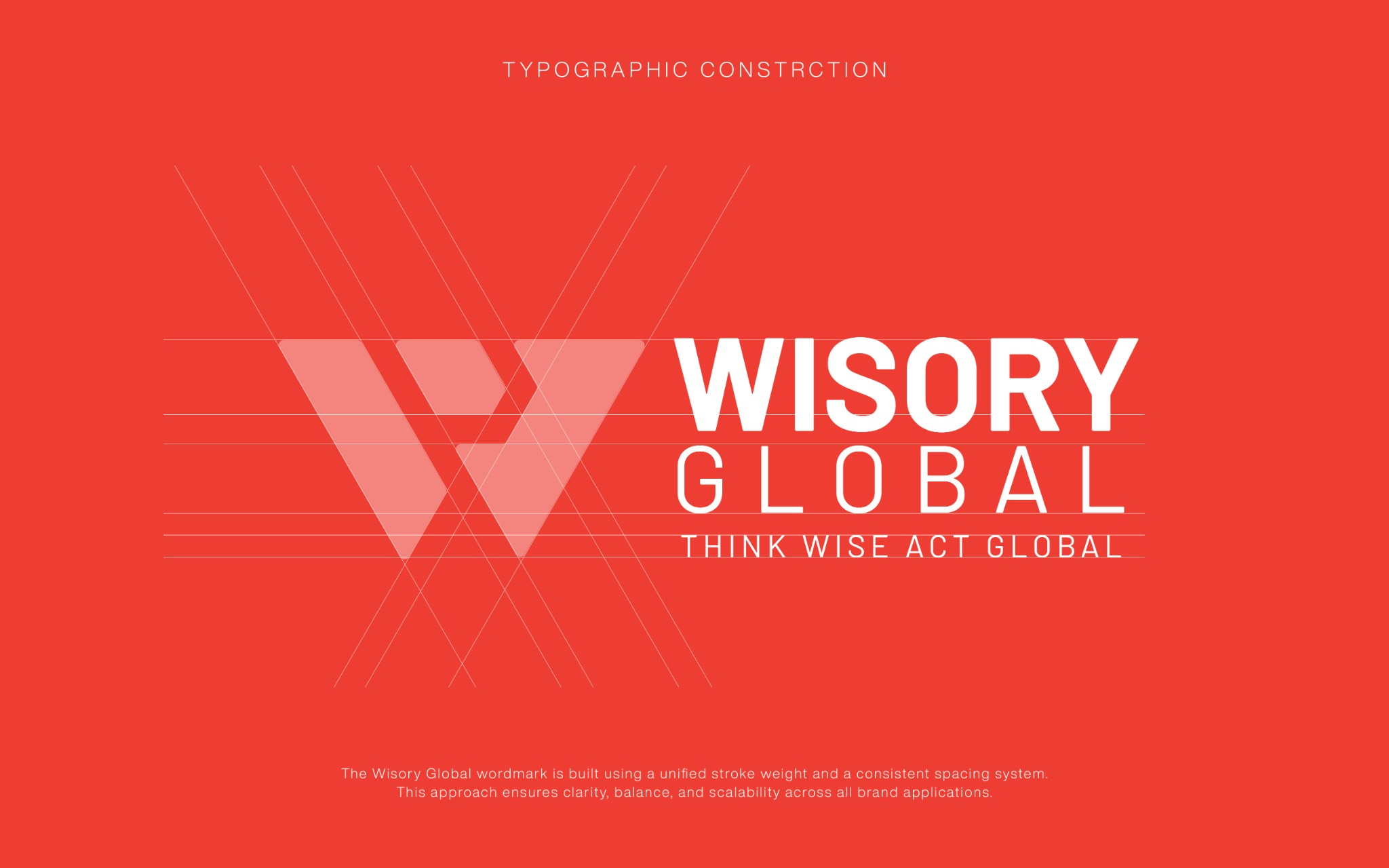
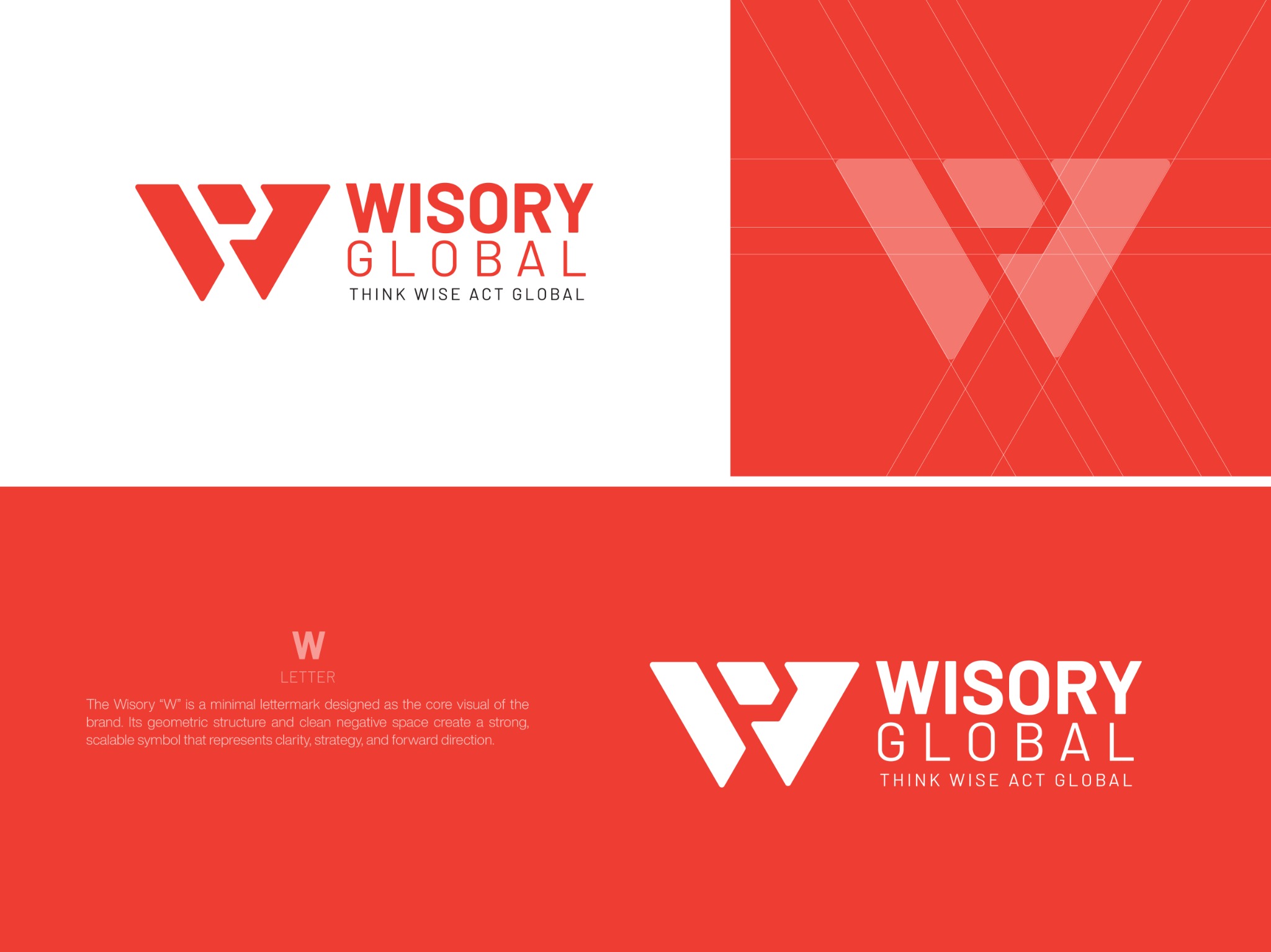
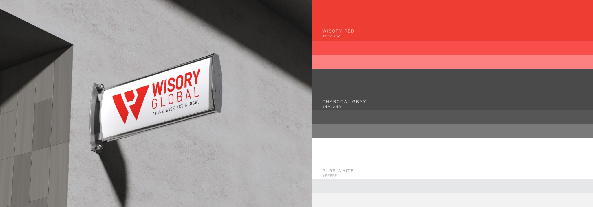
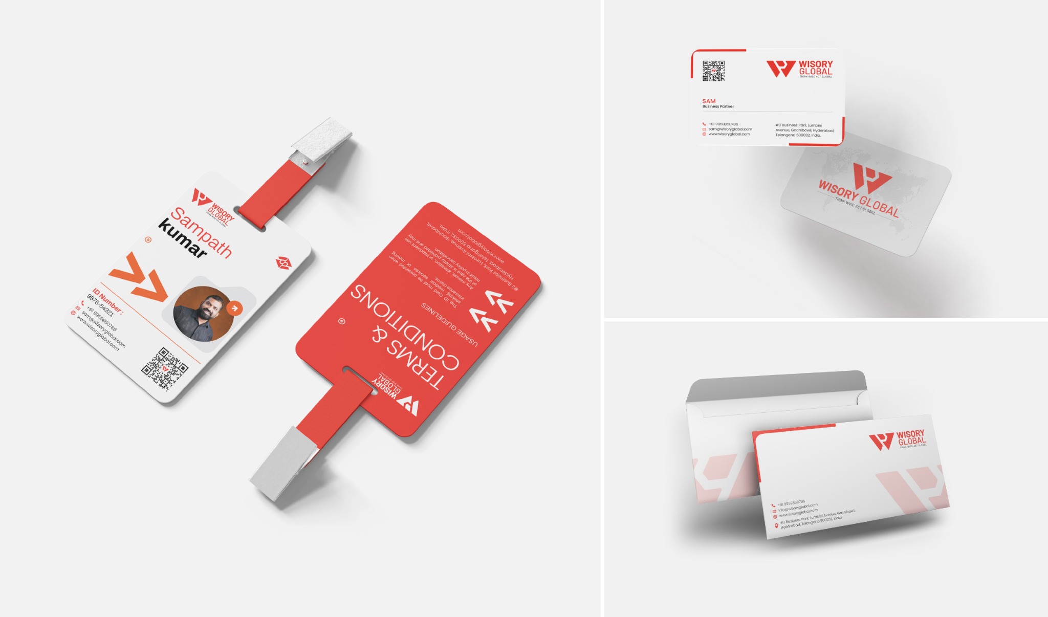
The identity uses a considered mark and typography as the foundation of a repeatable system. Logo variations and the colour palette establish the available expressions, while the application designs show how the same elements carry through different scales and formats.
The outcome
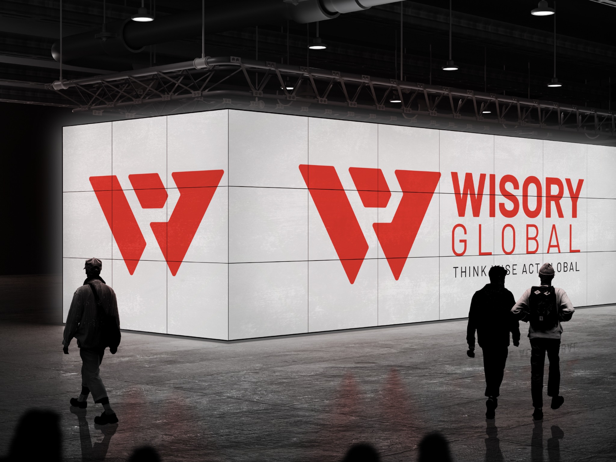
The case presents environmental signage, exterior branding, logo variations, stationery and ID-card applications. Together, these show the relationship between the core identity and the materials a business uses in practice. Review the gallery to assess the design system and the applications relevant to your own brief.

 Instagram ↗